

A business can have an excellent Google rating and still lose a website visitor in seconds. The rating lives on the search result or Maps profile; the buying decision continues on a landing page that may contain little more than the company’s own claims.
That creates a trust handoff problem. Search has supplied public evidence, but the website asks the visitor to start from zero.
Embedding reviews can carry some of that evidence into the next stage of the journey. The tactic works best when it is treated as part of conversion design—not as a decorative slider added to the homepage because competitors have one.
The goal is not to cover a site in five-star cards. It is to put the right level of customer evidence beside the question a visitor is asking at each stage: Is this business credible? Can it solve my problem? Is the experience worth the price? What happens if something goes wrong?
This guide maps review formats to those questions, explains how to build a responsible testing plan and shows how to distinguish a useful conversion signal from a flattering but meaningless metric.
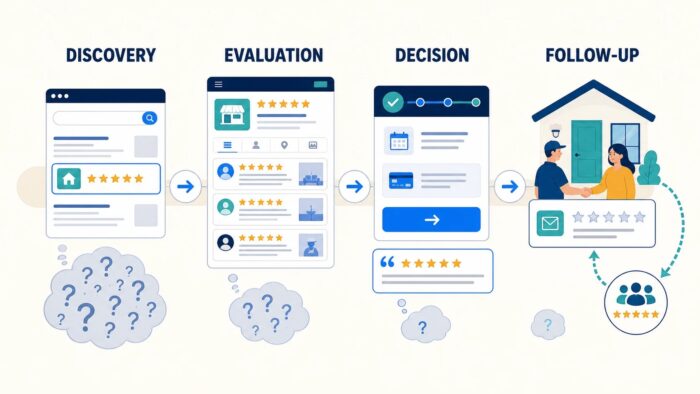
Image 1. Review content has a different job at each stage. A rating may earn attention early; detailed experiences resolve risk closer to the decision.
Reviews do not create trust by themselves
A five-star symbol is easy to recognise, but recognition is not the same as belief. Visitors evaluate several cues at once:
- Is the source named and familiar?
- Is there enough review volume to make the average meaningful?
- Are the reviews recent?
- Do different reviewers describe consistent experiences?
- Are the details relevant to the service being considered?
- Does the business respond thoughtfully, including when feedback is critical?
- Can the visitor verify the reviews outside the company’s website?
BrightLocal’s Local Consumer Review Survey 2026 found that consumers pay attention to consistency across reviews, recency, star rating and business responses. The practical lesson for marketers is important: the strongest review placement is not necessarily the one that shows the happiest quote. It is the one that gives enough context to reduce uncertainty.
This also explains why generic testimonials such as “Great service!” are weak conversion assets. They offer positivity without decision-making information. A detailed review mentioning response time, a difficult repair, staff communication or a measurable outcome can answer an objection that landing-page copy cannot answer as credibly.
Map evidence to the four-stage funnel
Website journeys are rarely linear, but a four-stage model is useful for planning: discovery, evaluation, decision and follow-up. Each stage calls for a different review format and level of detail.
Stage 1: Discovery — establish legitimacy quickly
A visitor arriving from search, an advert or a social post first needs to know whether they are in the right place. The page must lead with the offer: what the business does, where it operates and who it helps. Reviews support that message; they should not replace it.
Effective discovery-stage formats include:
- a compact rating and review count near the primary heading;
- a small “Rated on Google” badge beside a call to action; or
- a subtle proof strip below the main value proposition.
Keep this component visually quiet. A huge carousel before the service description forces visitors to read evidence before they understand the claim being evidenced. It also creates a risk that an external script delays the most important content.
The discovery-stage success measure is not “carousel interactions.” Look at the next meaningful action: continuing to a service page, opening availability, starting a product comparison or reaching the enquiry section.
Stage 2: Evaluation — make the proof specific
During evaluation, the visitor is comparing approaches and providers. They want evidence that resembles their situation.
A broad average rating is less useful here than a small set of relevant reviews. A roof-repair page should foreground experiences involving diagnosis, communication, workmanship and cleanup. A software page should surface comments about setup, support, reliability and the actual workflow.
This is where review themes become useful. Group genuine feedback around common concerns rather than presenting an undifferentiated wall of cards. Possible themes include:
- speed and punctuality;
- expertise with complex cases;
- clarity of pricing;
- customer support;
- durability or long-term results; and
- experience at a particular location.
Do not rewrite a customer’s words to make them fit a campaign. If text is shortened, use a clear excerpt without changing its meaning, and offer a route to the original source.
Stage 3: Decision — reduce the final perceived risk
The final step may be a purchase, booking, call or form submission. The visitor often understands the offer but still wonders whether completing the action will create hassle.
Place concise, relevant evidence near the point of commitment. A review about a simple booking process can support a scheduling form. A comment about accurate estimates can sit near a quote request. A review about responsive aftercare can reassure a buyer near checkout.
Avoid inserting a large, animated feed inside the form itself. It can distract from completion, cause layout movement or compete with validation messages. The ideal decision-stage review is brief, stable and directly related to the perceived risk.
Stage 4: Follow-up — turn delivery into a reputation loop
The funnel does not end after conversion. A business must deliver the promised experience, resolve problems and invite genuine feedback at an appropriate moment.
Google allows businesses to share an official review request link or QR code on receipts, in thank-you emails and after chat interactions. Its policy also states that incentives for posting, changing or removing reviews are prohibited.
A responsible follow-up sequence might look like this:
- Confirm the service or delivery is complete.
- Ask whether the customer needs help.
- Resolve outstanding problems through the normal support process.
- Invite all genuine customers—not only those predicted to be happy—to share an honest review.
- Respond to feedback publicly where appropriate.
- Allow the website display to update through its normal synchronisation process.
This creates a sustainable loop: real delivery produces feedback; feedback informs operations; selected review evidence helps future customers make decisions.
Choose the format by the objection, not the trend
Review widgets typically offer badges, grids, lists, carousels, sliders and floating stickers. None is universally best.
Badge
Best for: fast reassurance in headers, hero areas, navigation bars or footers.
Strength: compact and easy to scan.
Weakness: communicates popularity more readily than relevance.
Short list or grid
Best for: service pages, location pages and “why choose us” sections.
Strength: lets visitors compare several detailed experiences without interaction.
Weakness: can become visually heavy, especially on mobile.
Carousel or slider
Best for: a curated section where space is limited but several reviews matter.
Strength: shows multiple examples in one footprint.
Weakness: later cards may be missed; auto-rotation can reduce accessibility and distract users.
Floating sticker or drawer
Best for: persistent proof on longer journeys where it does not cover navigation, chat or consent controls.
Strength: keeps evidence available without repeating a full feed.
Weakness: can crowd a small screen and compete with other floating elements.
For a marketer who wants a reusable google review widget across these placements, GR Widget offers badge, feed, carousel and floating-style layouts through one managed embed. Start with one format matched to one objection, then add another only when it has a separate job.
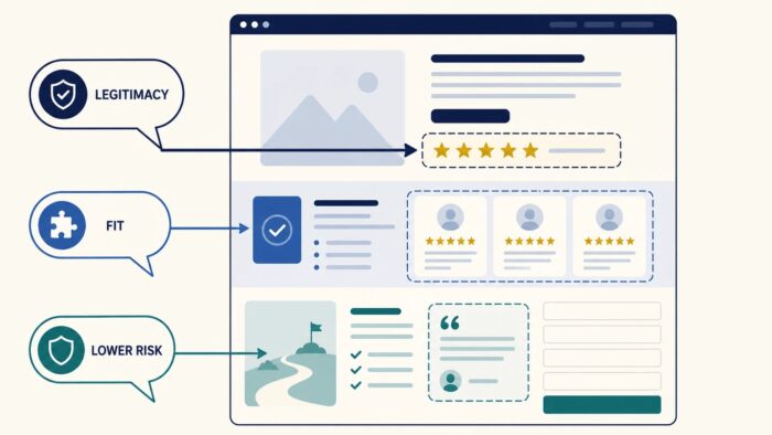
Image 2. Placement should follow the objection: legitimacy near the first claim, relevance beside service detail, and low-friction reassurance near the final action.
Build a review-to-objection matrix
Before changing the page, create a simple planning table. It prevents “add some social proof” from becoming an arbitrary design instruction.
| Visitor objection | Best evidence | Likely placement | Useful outcome |
| “Is this a real, established business?” | Rating, review count, source | Hero or first proof strip | Continue to service content |
| “Can it handle my situation?” | Specific, detailed review | Relevant service section | View details or case study |
| “Will the process be difficult?” | Review about communication or setup | Process section | Start enquiry or trial |
| “Is the price justified?” | Review describing value or result | Near pricing | Advance toward purchase |
| “What if there is a problem?” | Constructive review plus helpful response | FAQ or support section | Complete booking/purchase |
The final row is often overlooked. A page full of perfect praise can look curated. A balanced example, handled professionally, demonstrates how the business behaves under pressure. Google’s review guidance explicitly recommends valuing honest, balanced feedback and giving clear, professional responses.
Design a clean test instead of guessing
Once the page has a defined objection and placement, test the change. A simple experiment is more useful than a dramatic redesign with five simultaneous additions.
Write the hypothesis
Use this structure:
If we show specific evidence to this audience at this decision point, then this meaningful action should improve because this uncertainty is reduced.
Example:
If we show three recent installation reviews beside the commercial solar quote form, then qualified form starts should improve because visitors can see that similar projects were completed with clear communication.
This is stronger than “reviews increase conversions” because it can be disproved and teaches the team something even when the result is neutral.
Change one primary variable
Do not add a review feed, rewrite the headline, simplify the form and launch a discount in the same test. If performance changes, you will not know why.
Keep the offer and traffic allocation stable where possible. Test the presence or format of review evidence, or compare two placements with the same content.
Pick a primary metric before launch
Choose the outcome that represents progress:
- qualified enquiry completion;
- booked appointment;
- trial activation;
- checkout completion; or
- click to call for a local service.
Secondary diagnostics can include form starts, service-page depth and errors. Avoid treating time on page as an automatic win; a visitor may spend longer because the new component is confusing.
Allow for device differences
A floating badge might help on desktop and obstruct a call button on mobile. A three-column grid may become a long scroll on a phone. Review both the design and the results by device before declaring a winner.
Check speed alongside conversion
An embedded component can appear to help persuasion while making the page slower. Audit the external script, transferred data and layout stability. web.dev’s guidance on loading third-party JavaScript recommends asynchronous loading unless the script is essential to initial rendering.
The commercial result is the combination of persuasion and usability. A visually impressive feed is not a win if it delays the booking interface or causes a visitor to tap the wrong element as the page moves.
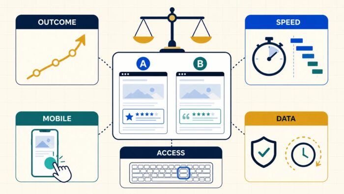
Image 3. A review-widget test needs a balanced scorecard. Conversion movement matters, but so do speed, usability and trustworthy source data.
Measure beyond the conversion rate
Conversion rate is central, but it can hide important details. Use a small scorecard.
Business outcome
Did more qualified visitors complete the intended action? Did lead quality, cancellation rate or refund rate change? A trust element should not merely persuade more poorly matched people to submit a form.
Technical cost
What changed in page weight, requests, rendering time and layout stability? Did the script load only where used? Does the page remain functional if the external service is unavailable?
Usability
Can visitors pause or control motion? Are carousel buttons usable by keyboard? Is the rating announced in text rather than only as star icons? Does a floating element avoid the cookie notice, chat button and mobile navigation?
Content quality
Are the reviews recent enough to reflect the current business? Is the source obvious? Do excerpts preserve meaning? Does the chosen content represent the service on the page?
Operational health
Who responds to new reviews? Who owns the widget account? How often does content synchronise? What happens when a location closes, rebrands or changes its public profile?
The review display is a marketing asset supported by operations and technology. If any of those owners are missing, the asset will decay.
Avoid tactics that weaken credibility
Do not hide the source
Removing clear attribution may make a card look more on-brand, but it also removes a verification cue. Visitors should not have to guess whether the quote came from Google, a private survey or the marketing team.
Do not imply a guaranteed search benefit
Displaying reviews can support visitor confidence. It does not guarantee rankings or star-rich organic results. Google’s review snippet rules restrict self-serving review markup for a business reviewing itself, including reviews embedded through third-party widgets, and Google never guarantees a rich-result appearance.
Do not manufacture urgency with review pop-ups
Messages such as “Someone left a five-star review two minutes ago” may attract attention, but they can feel manipulative—especially if the timing is simulated. Persistent proof is only useful when it is accurate and relevant.
Do not select only vague praise
Five cards that all say “Amazing!” add less value than two reviews that describe the problem, experience and result. Specificity makes evidence useful.
Do not neglect owner responses
The response is part of the proof. A calm, personalised reply to a concern demonstrates accountability. A repeated template under every review suggests automation without attention.
A practical rollout plan
For most sites, a measured rollout beats a site-wide launch.
Week 1: audit. List the high-traffic landing pages, their primary actions and the top visitor objection on each. Review existing Google feedback for recurring themes.
Week 2: prototype. Add one compact rating cue to a discovery page and one detailed, relevant review section to a high-intent service page. Check source accuracy, mobile layout, keyboard use and speed.
Weeks 3–4: observe. Run the prewritten test or, where traffic is too low for a formal experiment, monitor qualified outcomes and gather session-level usability evidence without overinterpreting small changes.
Month 2: refine. Keep, remove or reposition the component based on the result. Add another placement only when it addresses a different objection.
Quarterly: maintain. Review content freshness, synchronisation, account ownership, policy changes, accessibility and performance.
Final takeaway
Google reviews are most persuasive when they continue a trust story the visitor has already begun in search. The website should not shout louder than the source; it should make relevant evidence easy to inspect at the exact moment uncertainty appears.
Use a compact rating to establish legitimacy, detailed reviews to demonstrate fit, and a concise experience-based quote to reduce final risk. Connect post-purchase review requests to genuine delivery, not incentives. Test one hypothesis at a time and judge the result across conversion, speed, accessibility and lead quality.
That approach turns a review widget from a homepage ornament into a disciplined part of the conversion system.

Leave a Reply